 Dan James on July 16, 2015
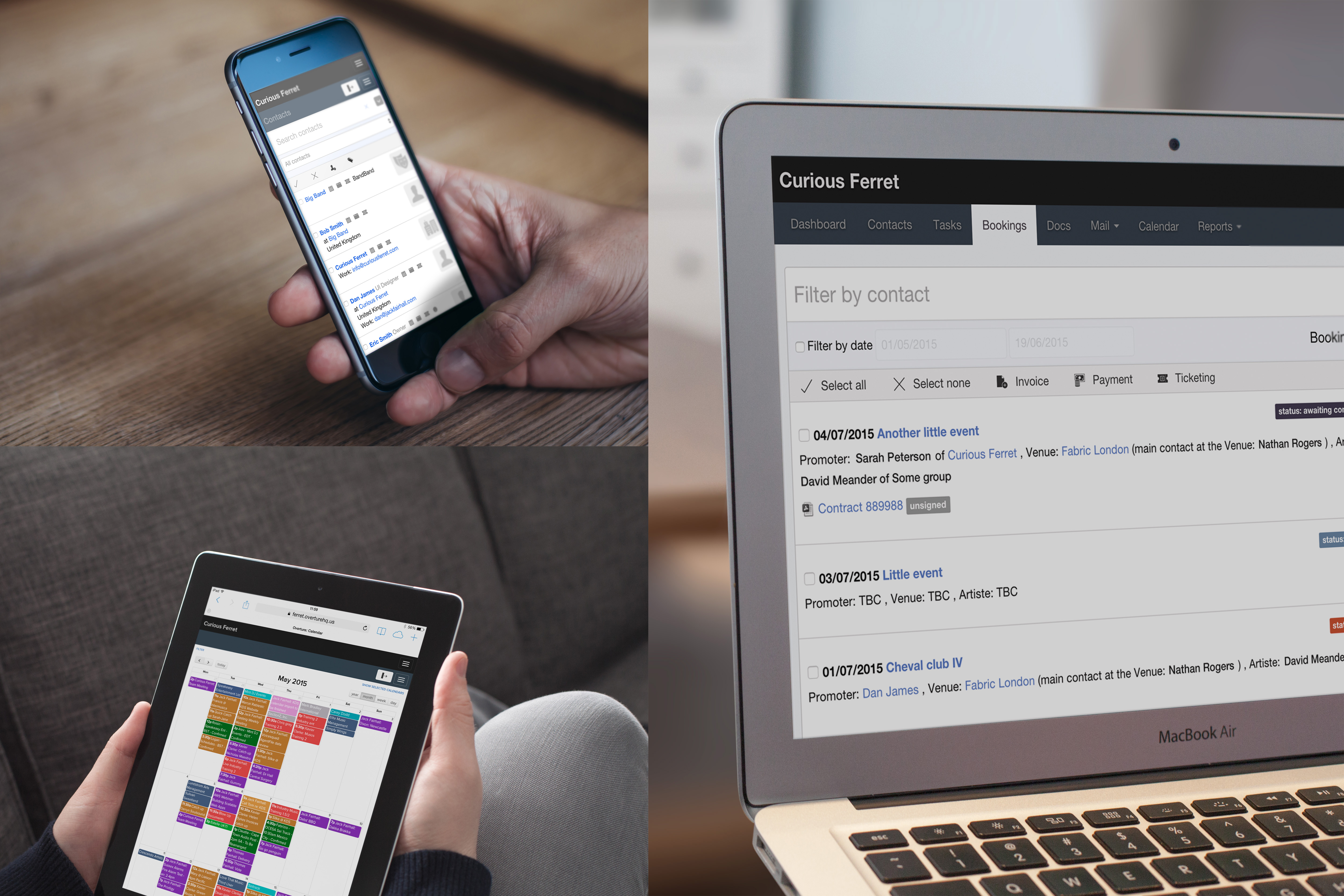
We have been working hard for months to bring you this news and we are almost ready to launch so here is all the information you need to get ready for the new Overture UI.
First things first – It’s the same
The first thing we wanted to let you know is that pretty much everything is in the same place. We have worked hard to make sure the experience for our users was only ever improved, so all the screens are the same the menus are the same and everything is in the same place or at least close to where it was in the old Overture. Phew!
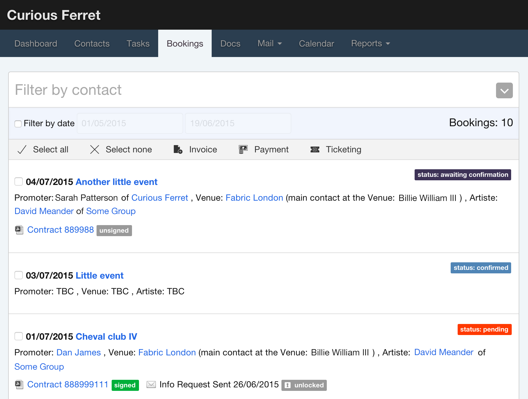
We have created new and improved buttons and sidebar boxes grouping items consistently across the app so that the experience is more homogenous. Forms now have a unique style that improves readability and flow, making them easier to fill in. Colours are more consistent and more meaningful, the icons and typefaces are more clearly defined to account for modern high resolution screens. All in all it’s awesome and we think you’ll love it. The best, however, is yet to come.
Mobile first
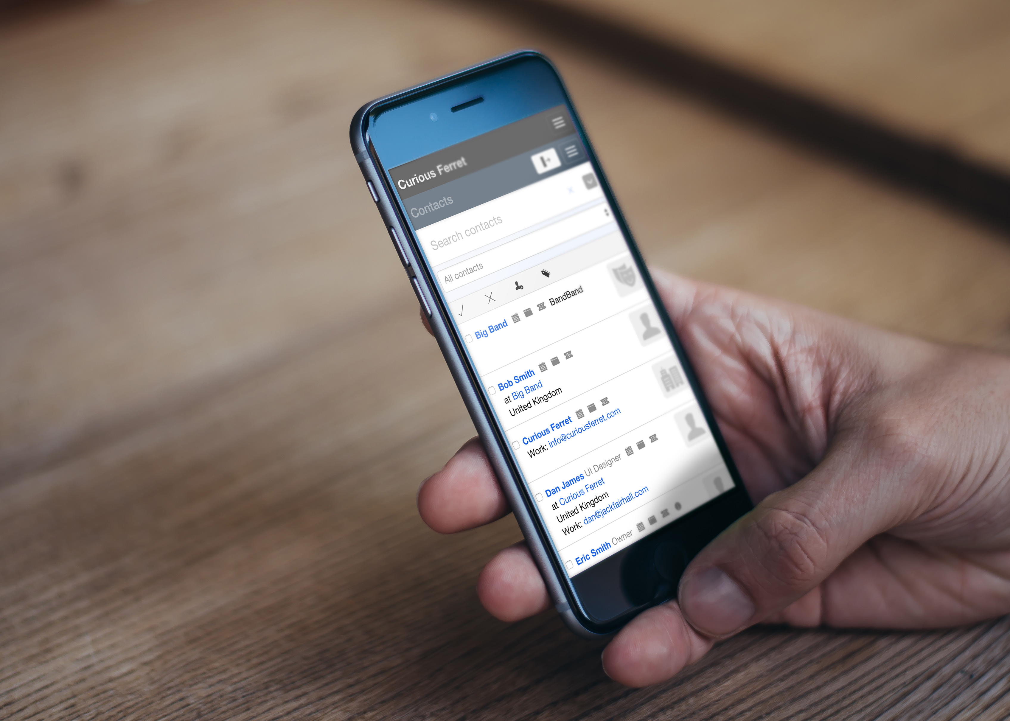
New Overture is responsive! Responsive means is adapts to the device you are using to work with the app. We designed the layout from mobile viewport size upwards to large desktops so that you get the best possible experience no matter what device you are using and where you might be. We know the majority or our users will work at desktop screen size, but the possibility of moving cross device whenever you need to is going to be very useful.
Go go gadget sidebar
With the responsive design in place we were able to add some lovely little touches. In the screenshot below you can see the header is generally smaller, taking up much less of the screen space, the reports menu and recently visited tabs and now nicely tucked away in a drop down navigation giving more space both on the reports pages and in the nav bar. Then in the top right (follow the arrow) clicking on that button shows/hides the sidebar giving a load more space on pages that need full width such as the calendar or larger reports.
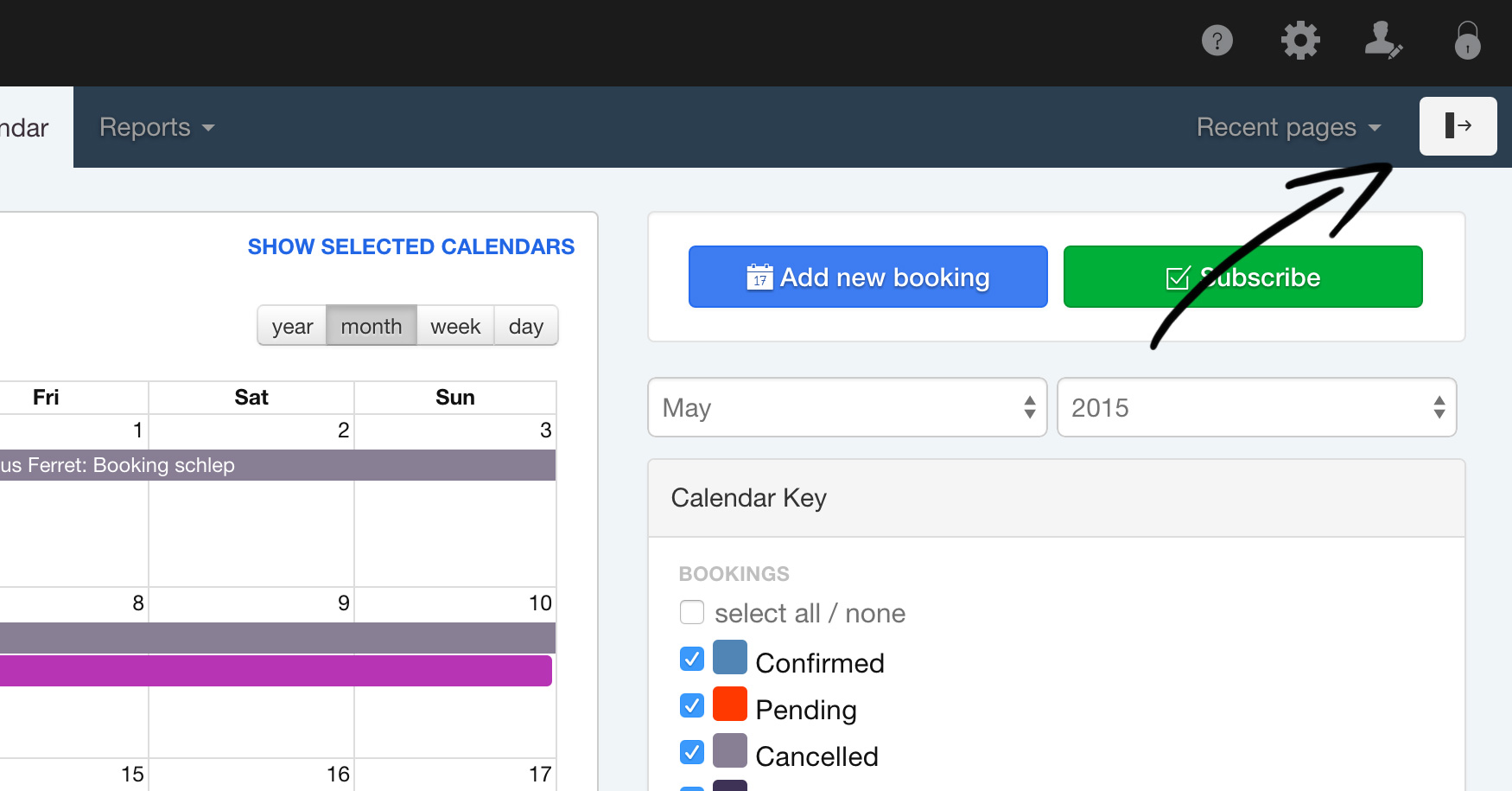
This then allows the sidebar to tuck away at tablet portrait and below to mobile so that all the same options are available whatever device you are on.
Other cool stuff
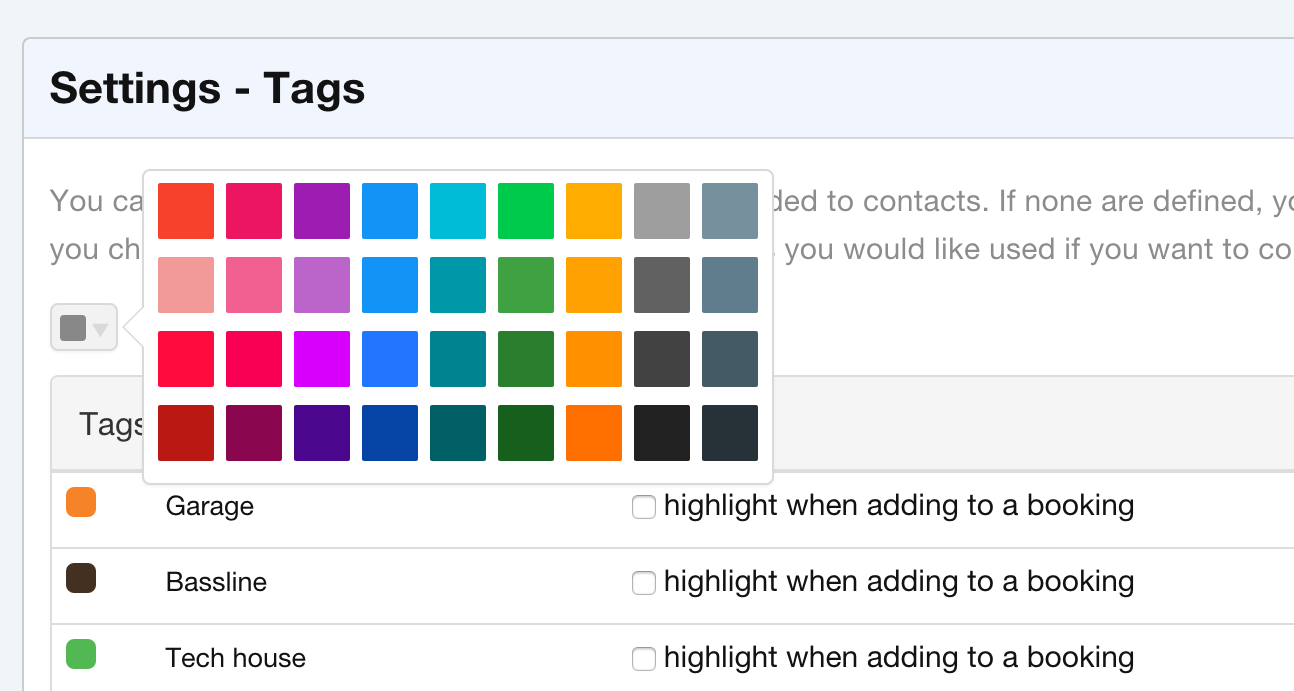
Apart from the bigger improvements we have worked on a bunch of other little improvements that should make using Overture simpler. Checkout the new little colour picker with a choice of lovely colours, no more having to navigate the complexities of a full spectrum colour picker and having a calendar full of bookings you can’t read the title of.
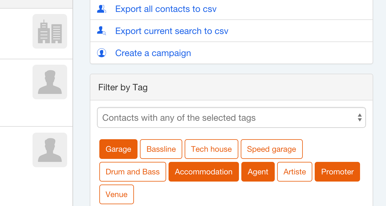
We have also improved a lot of the styles improving the overall user experience especially for new users. Grouping lots of the sidebar menu items into a single menu area and improving the look of the tags, making it easier to see when they are selected.
There are many more improvements that we will save for closer to the launch date. This is the biggest update Overture has had in the 5 years it’s been in business, for us it shows to our users that we are providing the best in technologies the web currently has to offer allowing you to interact with and carry out your day to day tasks wherever you are. We hope you like it as much as we do!